Friday, November 30, 2012

Review! Shadowman #1 (Valiant)

COVER: Patrick Zircher. Super cool black cover! (the reason I bought the book actually)...but it is a bit
                too dark to see the figure.
STORY: Justin Jordan and Patrick Zircher. Jordan has a limited writing background, and Patrick has
                less. It shows in this book. The initial story set up is good but then it goes into the longest, most
                boring sequence of the book. With only a bloody appearance by some future villain to break up
                the yawning. The dialogue feels odd and unnatural, and the way the main character,Jack, dresses
                feels lazy in design. Not much is explained as to what is happening but there seems to be a very
                important amulet that changes you into 'Shadowman'. Well, I hate it when an issue #1 of a series
                tries to get away with only showing you the hero for one page...the last page. Just because it is
                an issue #1 you don't have to tell us the origin of the hero. You have to make is care about them
                or we will not come back the next issue. Use a flashback story to fill us in, or through the very
                characters memories, hell just do it any place but the first issue. I don't even know what powers
                'Shadowman' has!
ART: Patrick Zircher. Aside from weak character designs ( a bald african-american with a goatee? seen
           that anywhere? a wanna be red "Venom"? the hero in a black t-shirt and jeans? really? ) Patrick
           has good artwork. Why cant anyone draw a believable "little person", not just someone who looks
           like a badly proportioned adult?
FINAL FILE: #1 and Done...nothing in this issue entices me to pay $3.99 to continue the story.

Variant Black cover...my copy looks even darker.

regular cover


Wednesday, November 28, 2012

Review! A+X #1 (Marvel)

COVER: Dale Keown. Great Hulk...sucky Wolverine.
STORY:  Dan Slott and Jeph Leob. Cap and Cable, okay. Hulk and Wolverine vs. Future Hulk and
                Wolverine, horrible dialogue, and strange ending.
ART:  Ron Garney and Dale Keown. Garney is a solid artist who just cant seem to take it up to that
            superstar status. Good work here. Keown is awesome at drawing the Hulks but his Wolverines just
            suck.
FINAL FILE: #1 and Done! The stories just seem rushed. Its just a weak 'Marvel Team-Up'.


Tuesday, November 27, 2012

Worth the cover price?

I remember when comic books where a couple of dollars. Now the regular price for a 22 page book is between $3 to $5. Yes we have better paper, printing quality, coloring and art but are they still over priced?
I'm going to pick on issue #13 of 'Justice League'. I have the variant cover version. It is a digital painting by Alex Garner.It is a very well done cover and I feel it does add to the value of this issue. The main story is 20 pages which cheats us out of two pages, a minus. Then we get a six page backup story that feels a bit out of place and just thrown in as a filler, a minus. When I pay for a title I like a full story of the characters I am paying for. Then we get the cheapest trick in the book. We get five pages of a totally different book ( in this case Superman #13) which we may or may not buy, but should be our choice. I am in a sense paying for five pages of advertising for another title without having a choice, huge minus. So I end up paying $3.99 for a thirty-one page book of which I am only interested in twenty of those pages. This is just one example of books that do this. Publishers seem to be taking advantage of the reader, especially one like me that buys his books online and is not able to peek through them to see what I am paying for. I don't like feeling cheated.


Monday, November 26, 2012

Big Boy Advice: The Tux

After all these years I have learned a few things that I wish I had been told when I was young. One of those
things is the Tuxedo. Unless you are an international spy or a billionaire crime fighter, you will probably have very few chances to wear a Tuxedo in your life. I whore my first at age 3 for a wedding, my second at my own wedding, and my third was this past weekend at another family wedding. My advice to you is to enjoy it, wear it with pride. It is the best you will ever dress as a man, and you will do it very few time in your life. Oh, and don't forget to do the "Bond,James Bond" thing.

Daniel Craig

James Cagney and  Paul Newman

Sean Connery 


Wednesday, November 21, 2012

Film Review! Twilight: Breaking Dawn part 2

   So my wife drags me to the final installment of the 'Twilight' series. Well, she had dragged me to the other
four so I kinda didn't mind seeing how it all ended. Now I'm not sure if this film was shot in conjunction with
part one of 'Breaking Dawn' but it felt very rushed. The effects where really bad, especially the daughter,
Renesmee. They used CG instead of a live child for her first few "years" of growth. It was so bad that even
my wife was distracted by the effect, and she loves these films. Lazy job . The entire film was a setup for the
big brawl with the 'Volturi'. It was a good fight actually, until it is revealed to us that it was NOT REAL!..
...WHAT? Alice just shows Aro, the leader of the 'Volturi', his future and just how the battle plays out...with
them losing and him getting his head torn off and burned. So Aro decides its better to not fight...you think?
So the fight never happened...boooooo,hiissssss! Cheap trick mister film makers. Then to top it all off the
film ends with one of the most cheese filled attempts to add sentimental value by showing a flashback of
how Bella and Edward met and their courtship.
Final File: See it if you saw the other films.Beware of the creepy CG baby. Enjoy the "fake" fight scene. Pray they don't make another one.


Thanks for reading...have a great Thanksgiving!...I have a wedding Friday so ill be back next week!

Tuesday, November 20, 2012

Whats up with variant covers?


        This is the variant cover to Action Comics #14. The artist is Steve Skroce. I know that Steve is a good
artist, I have seen his past work. Now I know he has not done much comic art for a while but that is no
excuse. This cover just sucks. What is Superman doing? If he is landing with a "super-slam", his body is
way too stiff  and unnatural. If he is jumping up and out of something then what is up with the cape?
Speaking of the cape...why is it like three times too long and big? The "angels" and all the rocks also appear
to be floating in mid air, not traveling at all. My thought was that variant covers where supposed to be an
incentive or a plus, not something that seems unnecessary. When I ordered this book online I did not get to
see what the cover was going to look like. I ordered it on the fact that it was a variant and I did not like the
original cover. Boy was I surprised...I don't like these kinds of surprises. To all publishers out there, If you
want to give us a variant, make sure it is good or don't bother. Mr. Steve Skroce, I know you don't suck
as much as this cover does. If your too lazy to do a good job, let someone else do it.

Friday, November 16, 2012

Review! Freelancers #1 (Boom!)

COVER: Felipe Smith (cover B). Sucks...His Manga style interior backup story is much better...stick to
                that style Felipe.
STORY: Ian Brill. The story of two orphans that train to be martial artists and bounty hunters has some
               potential...but this one just feels old. Nothing really new. Plus the two lead characters border on
               cliche stereotypes. The dialogue between the two girls is just awful.
ART: Joshua Covey. The artwork is not bad, a bit too animated feel, but not bad. He relies too much on
           coloring and has almost no blacks or shadows (and color doesn't replace backgrounds!).
FINAL FILE: #1 and Done! ( It was $1, I gave it a shot)

I was hoping to get this cover (by Noto)...

...I was sent this mess. (by Smith)


Wednesday, November 14, 2012

Review! Creator-Owned Heroes #5 (Image)

COVER: Dave Johnson. 'Killswitch' cover, love it.
STORY: Jimmy Palmiotti, Justin Grey, Steve Niles.  The first part of 'Killswitch'. Not bad, very
                "James Bond". Not much new. Also first part of 'Black Sparrow'. A creepy ,dark, old west story.
                Looking forward to part two.
ART: Jerry Lando, Andrew Ritchie. Lando's art feels way too amateurish. Needs to take some art
           classes.Plus where is the character that we see on the cover? The design is much better than the one
           inside. Maybe a good inker can make those pencils better. Ritchie has a very dark style. it fits the
           story real well but something about the figures feels off to me. Like if his photo references make it
           all a bit stiff.
           * I'm a bit disappointed with the two new stories in this issue. For $3.99 it cant just be good articles,
              it has to be very good comics too. These two feel mediocre at best.
FINAL FILE: Buy, Read, Bag it...but...it did take a dive.

Cover with no logo.


Monday, November 12, 2012

Review! Cyber Force #1 (Top Cow/Image)

COVER: Marc Silvestri. One of the unique veterans out there with a fresh feeling style.One thing that
                bothers me about his art is that he is still doing that "random, criss-cross, unknown shapes" thing
                that he invented in the nineties.Its his "go to" move but he doesn't have to use it on everything.
STORY: Marc Silvestri, Matt Hawkins. I didn't get anything new from this book. It feels like we have
                been there, done that. One bad choice was not really showing us who the "Cyber Force" is. The
                action was also lacking.This feels more like a number zero issue, too much back story and not
                enough character development.
ART: Khoi Pham.  Nice artwork, simpler than Silvestri but clear and clean...except for one thing. Khoi
           tries to copy the "random,criss-cross, unknown shapes" that Silvestri does and it doesn't work. He
           just puts in lines that feel unnecessary. In some cases it looks like he even confuses the colorist,
           Sunny Gho,  because the coloring is off on the "cyber" parts of the characters.
FINAL FILE: Buy,oooops!, get for free, Read, Bag it!
                        * You cant go wrong with a free comic by these creators.The whole 'Kickstarter' thing was
                           groundbreaking. Thanks guys!


Friday, November 9, 2012

Review! Mesmo Delivery (Dark Horse)

COVER: Rafael Grampa. Too freaken cool!
STORY: Rafael Grampa. Its a simple story with a complicated twist. I did not see the end coming and I
               hope that Grampa changes where he is going with it because I would love to see a second book.
               These characters are just too good to not get future stories.
ART: you guessed it, Rafael Grampa. In an industry that is full of copy-cat artists it sure is refreshing to
          see someone with a new style. Grampas art has a mix of Japanese Manga, Jeff Smith, and a little bit
          of Ralph Bakshi thrown in. It works. His character designs are so memorable, they border on being
          pre-iconic. Again, I hope he brings them back. ( and where the hell are those action figures?)
FINAL FILE: Buy, Read, wipe drool, Shelve it!


Thursday, November 8, 2012

Review! Creator-Owned Heroes #4 (Image)

COVER: Kevin Mellon. Cool cover.
STORY: Jimmy Palmiotti, Justin Grey, Steve Niles.' Trigger Girl 6 'started great and had tons of
               potential...and then we get this issue. They pulled this ending out of their butts. It went from a
               great spy/action story to an environmentalists wet dream...WTF?! Plus they write themselves into
               a corner with no place to go. Disappointing. Then we have 'American Muscle'. They kill off the
               villain and it ends with no clear direction. Strike two. Well next issue has two new stories, lets
               hope they don't strike out.
ART: Phil Noto, Kevin Mellon. Noto rocks! I cant decide if it is Mellon's art or the coloring that I just
          don't like.
          * The rest of the issue is good. Love the creator interviews.
FINAL FILE: Buy it to complete the stories, Read it but get ready to be disappointed, Bag it if
                        your a collector.

Cover I have...

...other cover.


Wednesday, November 7, 2012

Review! Justice League #0 (DC)

COVER: Gary Frank. Love this shot of Shazam!
STORY: Geoff Johns. Great modern take on the origin of Shazam. Geoff really gets the "kid in a grown
                up body" thing.
ART: Gary Frank. One of the best artists doing comics right now!
           * There is a strange backup story by Johns and Ethan Van Sciver featuring the "mysterious" Pandora
              and what seems to be an appearance by The Question.
FINAL FILE: Buy,Read,Bag it!


Tuesday, November 6, 2012

Review! Avengers vs. X-Men #12 (Marvel)

COVER: Jim Cheung. This guy has gotten really,really good. Great cover, wish he drew the interiors.
STORY: Jason Aaron, Brian Michael Bendis, Ed Brubaker, Matt Fraction, Jonathan Hickman.
                It took five top writers to write twelve issues of nothing. Two things happened. Charles Xavier
                was killed (and we all know that wont last, no matter what happens to his brain). The famous
                ' no more mutants' said by the Scarlet Witch was reversed. Yea, there was cool fighting between
                mutants and Avengers but that happens in half the books Marvel puts out anyway.
ART: Adam Kubert. Adam is a competent artist, but he bores me. He is one of those artists stuck on
           the same poses and panels and never gives us anything new. With such a high profile book they
           should have chosen a better artist...like Jim Cheung!
FINAL FILE: Buy, Read, Bag it...gotta complete the twelve issues right?


Friday, November 2, 2012

Review! Wolverine Max #1 (Marvel)

COVER: Jock. The only good thing about this book.
STORY: Jason Starr. A "Wolverine loses his memory" story, how original. How the hell are Wolverines
                legs cut off in the plane crash? Adamantium, remember?! Then they grow back? So his healing
                factor can regrow his adamantium laced bones now?!! WTF? This better not be a dream story.
ART: Roland Boschi and Conner Willumsen. I don't even know where to start. This is some crappy
           artwork. Some of the worst I have seen in a comic book. The main story (drawn by Boschi I think)
           has Wolverines face change from panel to panel. Look at his face on page 18...who is that guy? Then
           we have the flashback sequences ( drawn by Willumsen I would guess). What "genius" at Marvel
           decided that this should get paid for his art? I even hesitate to call it "art". It hurts my eyes. Is that
           "prospector" looking guy with the mustache supposed to be Sabertooth? I feel like he is trying to
           do an imitation of  Rafael Grampa's art...but fails badly! He makes me miss Rob Liefeld.
FINAL FILE: SKIP IT!...this is one of the single worst issues I have ever read. For a Wolverine
                        first issue it missed the mark by a mile. Bad job Marvel, this title will be canceled 
                        soon I predict, or it should be. On top of all the bad content we only get 20 pages of
                        story for $3.99...rip off. If you have not bought this book yet, DON'T! If you did 
                        then I feel for you...where can I get my money back?!

Do not let this cool cover fool you...


Thursday, November 1, 2012

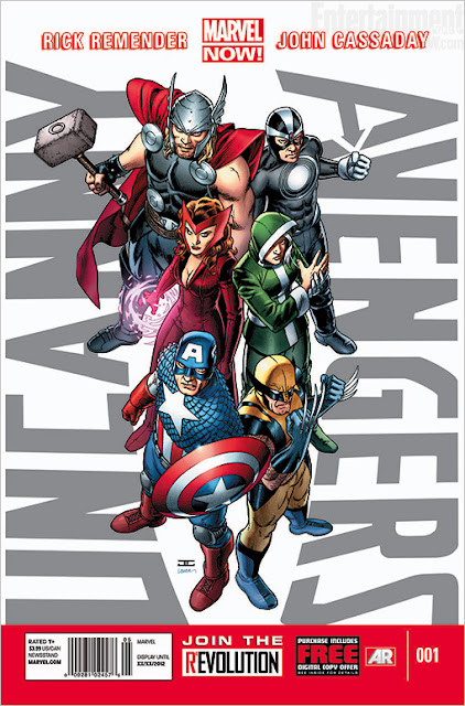
Review! Uncanny Avengers #1 (Marvel)

COVER: John Cassaday. Don't like this cover. The logo sucks and the characters look cramped.
SCRIPT: Rick Remender. There really is no team here. We can see the start of what will become the new
                 'Uncanny Avengers' but it looks to be a few issues away. So we learn two things this issue. One,
                  the Red Skull likes to mess with brains, especially Charles Xavier's. Two, the Red Skull hates
                  mutants.
ART: John Cassaday. I am a big fan of Johns work on 'Planetary'...not so much here. I just don't think his
           style fits the X-men or Avengers.
FINAL FILE: Buy,Read,Bag it!...its a #1 issue after all.