Friday, June 7, 2013

Game of Thrones

WOW!

The June 2nd episode...shock.

I have not read any of the novels so everything is new to me. After what seemed like an uneventful season,
the hammer drops. Big time. So good.

I did not mind that Catelyn Stark died, she was a walking heart break after all she had lost, and thought she had lost. Rob and his bride deserved a much better death...a longer life for that matter. To think that justice is now in the hands of small boys, their sister and a half brother in John Snow is a daunting task. There truly may not be a happy ending to this story...and fitting at that.

Great stuff.

R.I.P.

This is my final entry for this blog.
I want to thank everyone who took the time to check out my tiny corner of this great and powerful world wide web. It was an experiment for me to learn and share my thoughts on things I enjoy and hope you enjoy as well. I close this chapter after one year but only to move on to others. 
It was a great ride.
I will be out there somewhere, we shall meet again.

artist221

Thursday, June 6, 2013

Review! Jupiter's Legacy #1 (Image/Millarworld)

COVER: Bryan Hitch. Sweet...I chose it right?

STORY: Mark Millar. 20 pages? 20 f***en pages?And 8 pages of adds? WTF!? This book should cost
                $1.99 not $2.99...anyway...strange start. So some explorers back in the 30's found some island
                and got superpowers. They had kids. The kids are all dicks. That is all folks.

ART: Frank Quitely. I am a big fan of Quitely's work. This confuses me. Every panel feels like a mid-shot.
           No real closeups or variant angles...sad to say but it felt boring.

FINAL FILE: BUY,READ,BAG IT!...barely...i expected more from all the hype. Issue two better
                        crank it up a few notches.


Monday, June 3, 2013

Review! The Movement #1 (DC)

COVER: Amanda Conner. Not sure why these characters are standing with water over their heads...and
                 giving some very dirty looks to us. Strange cover.

STORY: Gail Simone. So there seems to be a "movement" of young super powered boys and girls that are
                fighting against a city conspiracy and some demons? I think. I am a big fan of the DC Universe
                and I thought I knew it well, but I have no idea who these characters are, and I am led to believe
                that they are not new. There is a character named 'Mouse' that has the power to control rats. He
                is even shown riding a wave of rats like a surfer...yuck. And if he can control rats why call himself
                Mouse? Bad times for DC. Bad times.

ART: Freddie Williams II. Decent art. A bit too "squishy" and cartoony for the story but okay.

FINAL FILE: SKIP IT!...or "move" along to the next thing...comic books are not cheap anymore
                        and companies need to stop putting out sub par titles and spend their money on
                        quality to keep the cost down and the prices down. If I can tell what is good and
                        what is not so can an editor.

Strange cover

The art is squishy and crowded at times

Friday, May 31, 2013

Review! Charismagic #1 (Aspen

COVER: I got the 'Special Reserved Edition'. It credits the cover to Vincenzo Cucca, but the
                cover art has a very clear signature by Khary Randolph...what gives? 

STORY: Vince Hernandez. This book opens up with a rather offensive scene. It is set in south central
                Los Angeles, which is primarily an African-American community. The characters are all
                stereotypes from the clothes to the manner of speaking, so much so that it borders on racist. Not
                a good start. This is another title that Aspen is relaunching, that gives the advantage to people who
                have read the older issues and know what they are getting into. I was a bit lost but I don't care
                enough to be found. Not a big fan of magic stories, they always feel like a cop out to me.

ART: Vincenzo Cucca. Aspen loves these guys with a "cartoony" style. They do not always fit the mood of
           the story, as in this case. Another trend that seems to follow Aspen books is the over coloring, also
           in this book (by Emilio Lopez). Aspen, you don't have to keep hiring guys that draw like Michael
           Turner or J. Scott Campbell, diversity would be nice.

FINAL FILE: Well, it is only $1...but is it even worth that dollar? If you are a fan, great, but I dont
                         think this book will gather too many new readers...a talking cat? really?! Aspen
                         is not putting out any winners so far.


Tuesday, May 28, 2013

Film Review! The Hangover 3

The best thing about this film is the final five minutes.

Other than that this was a huge waste of time and money. It had nothing to do with any kind of hangover which was the entire working formula from the beginning. There was nothing magic here at all. The story was all about Leslie Chow and Zach Galifianakis's dessert dry humor, which is not for everyone. When a film has to add Melissa McCarthy for new blood you know it is in trouble.

A sad way to end it.

This is how it all began...with a BANG!...

This is how it ends...with a whimper...R.I.P.

Monday, May 20, 2013

Film Review! Star Trek: Into Darkness

WOW!

A really good Star Trek film.
Who would have thought.

Good story,good acting,good cast...great villain!

Benedict Cumberbatch steals the film (and I'm sure it is no secret anymore) as Khan. His voice alone is menacing, but he kicks some major ass.

If you have seen the older films you will enjoy this one much more. There are plenty of mirrored scenes that are just very cool.

So this Star Wars fan is telling you to go see a Star Trek film, go figure.


The Enterprise might get into some trouble

Sexy girls in a Star Trek film? Why not!

Wednesday, May 15, 2013

Review! Injustice: Gods Among Us #1 (DC)

COVER: Jheremy Raapack and Tony Avina. (third printing) Very nice painted cover!

STORY: Tom Taylor. DC is too big. Their characters and properties are worth too much money. That is
               why this kind of project is a breath of fresh air. This story can only be told in an alternate universe
               where you can show the consequences to the villains and heroes actions. It really makes the
               regular DC Universe feel stale. I am actually very surprised it took a video game to make this
               happen. Great start.

ART: Jheremy Raapack, Mike S. Miller, Axel Gimenez. (three?really?) This is a book with a very
           dark mood to it. So why the heck did DC decide to use three artists who are so damn "bright and
           shiny" in style? The cover has a dark feel to it, and from the advance images of the game, it looks
           like it will follow suit. I do not understand comic book editors.

FINAL FILE: BUY,READ,BAG IT!...never thought I would like a comic based on a future video
                        game, but I did.

Third printing cover...thanks CBR

Thursday, May 9, 2013

Review! X #0 (Dark Horse)

COVER: Raymond Swanland. Very nice painted cover!

STORY: Duane Swierczynski. Good self contained story. Gives a good starting point for the main series.
                X is pretty much the Punisher with a mask. Lots of blood.

ART: Eric Nguyen. I was very surprised at how much I liked this art. It is not polished by any means but
           it really fits this title well.

FINAL FILE: SPLIT DECISION...good book, but not sure yet if it is worth picking up every 
                        month...guess I'm reading issue #1.

Like the cover

Nice art...bloody

did I mention it is bloody?

Tuesday, May 7, 2013

Film Review! Iron Man 3

Cool!
Very cool!

Such are the 'Iron Man' films.
This one is no different.

If you like to see a lot of the suit, well, you will get more than you ever asked for. If you like to see and hear the brilliance of Robert Downey Jr. as Tony Stark, well, you will get your fill of that too. The "relationship" that Tony has with the small town kid he encounters is just great. Some of the best dialogue in the film. Also, in a strange, but well done twist we get a very fresh look at the Mandarin character as you have never seen him before, trust me. I also got to know a new fact about Tony Stark...he has mild autism! Look at all the evidence and you will agree. Socially awkward. A mathematical and physics savant. And he eats gluten free.
Case closed.

Look out for Pepper Potts kicking ass.

And you get Iron Patriot.

One of the best from Marvel so far.

MUST SEE!

Lets hope this is not the last one.

Its all about the armor

I dont care what anyone says...I love the Iron Patriot armor


Friday, May 3, 2013

Review! Jirni #1 (Aspen)

COVER: Paolo Pantalena. Nice...but the coloring by Brett Smith is killer!

STORY: J.T. Krul. A girl with powers,a mom, a d'jinn, a quest started. Nothing new so far.

ART: Paolo Pantalena. It is clear that Paolo loves Joe Madureira. The pencil samples of his work in the
           back of the book are nice. This book has a problem with over coloring. the saturation of colors in
           every single page just gives me a tooth ache! Tone it down a bit, the line art is better than you think.

FINAL FILE: Worth the $1...don't see myself picking up #2


Wednesday, May 1, 2013

Review! Wolverine #1 (Marvel)

COVER: Alan Davis. Nice shot of Wolverine coming at ya!

STORY: Paul Cornell. Feels like a small story about a powerful gun and a kid who is more than what he
               seems to be, but I bet it gets bigger. Okay start.

ART: Alan Davis. The one and only reason I ordered this book. Davis is one of the masters of comic
           book art. Most people might not know this but Bryan Hitch started as a straight up clone of Davis,
           and look how popular he went on to be. Anything Davis draws is worth the price of the book.

FINAL FILE: BUY,READ,BAG IT!...a Wolverine #1 with Alan Davis art is a win.Lets hope the 
                         story can keep up.

Add caption

Creepy kid...

Naked Wolverine...always funny!

Painful way to start a series

(This is not in Wolverine #1 but I just wanted to show how good Alan Davis is!)

Monday, April 29, 2013

Review! Age of Ultron: Book One (Marvel)

COVER: Bryan Hitch. Nice chromium embossed cover! Ultron shiny...huh huh

STORY: Brian Michael Bendis. Another apocalyptic, alternate reality for the Marvel U. Do these people
                have any hope at all for a normal future? Anyway, this one starts off good, even if we never get to
                see the main villain. Hawkeye rescuing a captured Spider-Man is very cool.

ART: Bryan Hitch. One of the best...even with those strange poses he sometimes throws in (page 11,
           Spider-Man's left leg, what is he doing? And page 12, what is wrong with Hawkeye's right arm?
           Ouch, looks painful).

FINAL FILE: BUY,READ,BAG IT!...one complaint, why did they put the "roster" page toward 
                        the back of the book? Wouldn't it serve the story better in the beginning?


Bad days for New York and our heroes

Blurry...hurt...eyes

what the heck is wrong with Spidey's left leg?

Friday, April 26, 2013

Review! Secret Avengers #1 (Marvel)

COVER: Tomm Coker. Fits the book, nothing special.

STORY: Nick Spencer. So agent Phil Coulson (of the Avengers movie fame) gets to lead a secret team of
               Avengers that seems to consist of Hawkeye, Black Widow, and the new Nick Fury. A surprise
               ending leads us to see that S.H.I.E.L.D. will use some dirty tactics to get the job done. Good start
               to the series but this can only end one way...badly, when the heroes discover what is really going
               on. I look forward to it.

ART: Luke Ross. Very good fit.

FINAL FILE: BUY,READ,BAG IT!...good start, look forward to this monthly read.


Thursday, April 25, 2013

Review! Star Wars: Legacy #1 (Dark Horse)

COVER: Dave Wilkins. Very nice painted cover.

STORY: Corinna Bechko and Gabriel Hardman. I never like two writers. It tends to blur the vision of
                the story. This book is set 138 years after 'Star Wars: A New Hope' and it stars Ania Solo, a
                descendant of  Leia and Han. She comes across a light saber that becomes hot property real fast.
                I'm not sure how old this girl is but she seems to be too young to be running around the Star Wars
                universe all alone...well, with a young Mon Calamari, Sauk. It also looks like the war between
                Sith and Jedi still exists, but with new players. Good start, just have to get used to all the new
                faces.
ART: Gabriel Hardman. This is the kind of art that best fits the Star Wars Universe. I have never liked it
           when they use a cartoony or bright style. Hardman has just the right gritty feel that this book needs.
           Good choice.

FINAL FILE: BUY,READ,BAG IT!...good start!


Monday, April 22, 2013

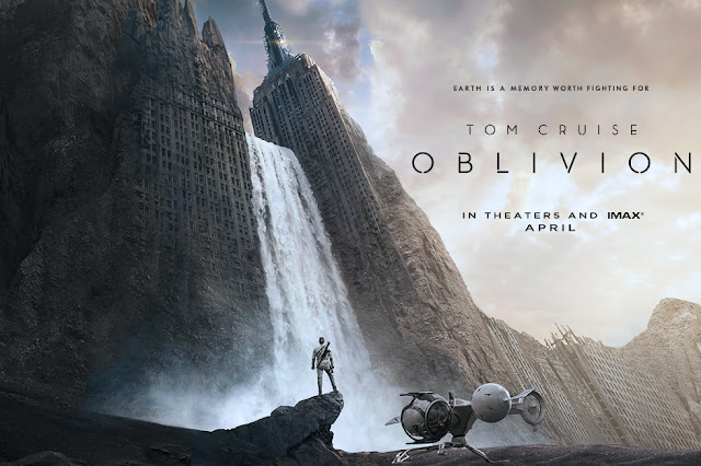
Film Review! Oblivion

Yawn-ish.

A bit scattered.

There are a few sci-fi genre films coming out this year and I think this might be the weakest of the lot. The story of Jack (Tom Cruise) and his post-apocalyptic adventures is rather all over the place and somewhat confusing. I cant give away the"secret" of the film but it is one that has been used before. Think hard. The usual survivors of a world ending event are all present. Even Morgan Freeman makes a mandatory turn as the leader of a group of surviving rebels. It has some nice visual effects that are large in scale. The story is just too weak and the motivation of almost all the characters is not very clear.( I'm still not sure what Jack was fighting with when he falls into a hole that was once the New York library...they did not seem human)
There is a bright spot in Julia (Olga Kurylenko), very hot.

FINAL FILE: Skip the theater, wait for the DVD.

Yes...you my feel this way too

Tom Cruise's ship is the co-star

Love concept art

Love Olga...a young Catherine Zeta-Jones right?!

Wednesday, April 17, 2013

Review! Batman and Robin #18 (DC)

COVER: Patrick Gleason. Great cover!

STORY: Peter J. Tomasi. This is a tricky one. Tomasi wrote the book, but the book has no dialogue. So
               we give him credit for the plot and the panel descriptions? Sure.

ART: Patrick Gleason. It is books like this that make comic books such a great medium. A silent issue,
          told only in pictures, and told incredibly. You can see the heartbreak and anger in Bruce, Alfred, and
          even the bat-dog Titus. True storytelling.

FINAL FILE: BUY,READ (or look at), BAG IT!...as much as I liked this issue I hope that this
                        death (if it sticks) has true repercussions for Bruce and his bat-universe. Like
                        "no more Robins" for one, or any kid vigilantes of any kind.

Great, moody, cover

Original cover solicitation...to throw us off...used in story

Loneliness 

A fathers pain


Monday, April 15, 2013

Review! Guardians of the Galaxy #1 (Marvel)

COVER: Steve McNiven. Always good!

STORY: Brian Michael Bendis. The Guardians are a pretty well known team in the Marvel universe. This
                allows for Bendis to get us right into the meat of the story without too much intro (plus they did
                have a point one issue to help). The set up is that Earth is the focal point for the teams adventures
                and Bendis did this very well. Putting Iron Man as a member of the team helps too. Good start.

ART: Steve McNiven. This guy can make any book look good. Always in the top five comic artist list.

FINAL FILE: BUY,READ,BAG IT!...without the great artwork I'm not sure i would have given 
                        this book a chance, but I'm glad I did...the Guardians of the Galaxy have always
                        been C-list characters at best, I hope Marvel can keep them going...with the film
                        coming out it will help, but I predict it will be Marvels first bomb at the theaters.
                        They are just not that well known.


Star-Lord's conflict with his father is interesting.

Cool team shot! Cool team!

Friday, April 12, 2013

Review! X-Termination: Part One (Marvel)

COVER: Ed Mcguinness. I know this guy is a fan favorite ( whatever that means now-a-days) but I just
                think he draws everyone too thick. Okay cover.

STORY: David Lapham, Marjorie Liu, Greg Pak. (really? three people?) This feels like Marvel had
                intended it to be a major crossover event...but it is not. 'Age of Ultron' is out at the same time and
                I don't think people care too much about an alternate universe character (Age of Apocalypse
                Nightcrawler) off of a canceled book (Uncanny X-Force) that teams up with two other canceled
                books ( X-Treme X-Men and Age of Apocalypse)...bad timing Marvel. "Who cares" story with
                "who cares" characters. Too bad because 'Age of Apocalypse' was one of my favorite titles when
                it started, and it has ton of potential.

ART: David Lopez. Just okay. I went to this guys blog to see more of his work and it is much better than
           the art in this book. Maybe his next project will be better.

FINAL FILE: SKIP IT!...When I ordered this book it was a big deal...Marvel killed it...it deserved
                        a better death along with the titles it ended.


Wednesday, April 10, 2013

Review! Poison Elves #1 (Outlaw/Ape Entertainment)

COVER: Darick Robertson. Not a big fan of Darick's work, but a nice pic.

STORY: Robb Horan.  Wow. Where to start? Totally confusing. I believe the story is being told by an
                elf character who,obviously, has survived some form of quest for him by another elf. I'm not sure
                if this book is easy for old fans of 'Poison Elves' but I was totally lost. Too many new names and
                places and with the black and white art it was hard to tell who was who some times. Then, to
                make things even more confusing, we get some kind of zombie-elf-jester that breaks the fourth
                wall and comments on the action. I hate fourth wall breaks in comics. That is the main reason I
                don't read any 'Deadpool' comics. Anyway, this issue is just not for new readers...wait...they put
                a primer at the back of the book? The back? So you find it AFTER you mud your way through
                this puzzle of a story? Thanks for nothing geniuses!

ART: Montos. Who? Mediocre at best.

          * There is also a four page backup story by Keith Davidsen and Shannon Ritchie. Just as confusing as
             the lead story. The artist also feels the need to fill in every micro-inch of space of every panel with
             his art. That is not the way to tell a good story people. Color would help.

FINAL FILE: SKIP IT!...if you are a fan and know what you are getting then go buy it...if not...this
                        book will not be fun. The entire book feels like student work, bad student work.

Best thing in the whole book.

Unless you are Frank Miller, do not do B/W comic art.

Must...fill...every inch...with art...


Monday, April 8, 2013

Review! Sex #1 (Image)

COVER: Piotr Kowalski. Rather nice cover.

STORY: Joe Casey. He named the book 'Sex'.What the title has to do with the story is not clear to me.
                It looks like the story is about a retired hero who comes back to the big city he used to protect.
                The main character never puts on a costume and we never see one in this entire book. So if that
                is what you are looking for this wont be the book for you. If you picked up the book because of
                the title, well, you do get some graphic, unneeded, over the top lesbian action that was probably
                put in to justify the title. Maybe a second issue will clear things up a bit, but I'm not spending  my
                money to find out.

ART: Piotr Kowalski. Nothing special. The line work is rather weak and the figures are generic looking
           in design. I'm sure the sex scene was fun. The art is just overwhelmed by the coloring ( by Brad
           Simpson). I think he was trying to channel a 'Watchmen' feel from the 80's, but its not the 80's
           anymore and it just looks bad. I actually think Brad just doesn't have any green to paint with.
           * The lettering by Rus Wooton was good...but what the hell where those color block highlights?
             
FINAL FILE: SKIP IT!...this is how I picture the pitch for this title playing out...
                                          Comic Creator: " I have this great idea for a new series about a guy that comes
                                                                    back home after retiring"
                                          Comic Publisher: " Cool, what is it called?"
                                          Comic Creator: "Uuuuu..."
                                          Comic Publisher: " Call it 'Sex', sex sells."
                                          Comic Creator: " But that doesn't fit my story."
                                          Comic Publisher: " So make him a sex addict."
                                          Comic Creator: " Okay."

Gratuitous sex scene,CHECK!...bad coloring, CHECK!


Friday, April 5, 2013

Review! Shrugged 2 #1 (Aspen)

COVER: Jonathan Marks. Cover B. Cute.Nice colors.

STORY: Frank Mastromauro. If this is your first 'Shrugged' comic, like me, I hope you did not expect
               much. The story seems to be about a teen boy who has a female conscious (named Ange...really
               ..."ANGEL"?) on one shoulder and a male demon (named 'Dev'...really..."DEVIL"? how very
               not clever) on the other. I'm not sure if this is Franks first writing gig, but it sure feels like it. The
               "banter" between Ange and Dev is beyond annoying. They are perfect stereotypes of the goody
                goody angel and the bad boy devil, but they argue like brother and sister. Frank also needs to
                brush up on his teen lingo. No teenager talks the way his characters talk. The African American
                kid says things like, "slow your roll", and "your creepin on my airspace", and "gotta jet"...who talks
                that way?! What year is this comic set in? Then he has a female classmate say "Heya sport" to the
                lead character. Really? would a teen girl say that to a teen boy in any high school in any era?!
               Horrible!! Then comes the strange scene ( out of nowhere it seems) where some demons are
               racing through some caves? Who?What?Where?...no explanation given or introduction. (also
               what the hell is happening on the second to last page?) Not user friendly for new readers.

ART: Jonathan Marks and Micah Gunnell.  Don't know who did what but they are both very
           amateurish looking. The cover is the only good drawing in this book. The coloring by Beth Sotelo
           is too bright and shiny, makes it cartoony.

FINAL FILE: SKIP IT!...if you read the first series and liked it, go balls, but this book is not for
                        new readers...or readers of good comics.
Nice cover...but thats about it.

Wednesday, April 3, 2013

Review! Green Arrow #17 (DC)

COVER: Andrea Sorrentino. I get the 'We Can Be Heroes' cover when available. The Sorrentino cover
                 is rather nice.

STORY:  Jeff Lemire. So I guess the young Oliver Queen has lost his company,friends, and money?
                 There is also another archer ( is that the only kind of villain an archer hero can have?) trying to
                 kill him. At one point, Olie gets shot by an arrow through the wrist, he pulls it out and continues
                 as if nothing happened...?? Is Olie super human now? Or is his healing factor really good?                
                 This is a hitting rock bottom story that is setting things up for the next chapter in Olie's
                 life. Good jumping on point for new readers.

ART: Andrea Sorrentino. This guy still feels like a wanna-be Jae Lee to me, but not quite as good. Most
          of his faces look oddly shadowed. He also makes Olie look too young in some panels. Overrated.
          * From the credits it looks like Andrea also colors the book. Well, he has a habit of "not coloring"
             certain parts or the story that is more distracting than cool. His coloring is also flat.

FINAL FILE: SKIP IT!...unless you are a die hard Green Arrow fan, this title is not for you. I was
                        hoping the hype surrounding the artwork was true...it was not.


Odd "non-coloring" by Sorrentino.

More "non-coloring"

Super Olie!!